A church rooted in 1927 that finally looks like it belongs in today.
First Lutheran Church of Kelowna had nearly a century of faithful history behind it—founded in 1927 by German immigrant families with a vision to plant deep roots in the Okanagan. What it lacked was an identity that communicated the remarkable thing it had become: a church that holds ancient, liturgical faith in one hand and genuine modern relevance in the other. Engagement Group gave that church a new name and a brand worthy of both.
Problem
A church offering something genuinely rare—in a community that had no way of knowing it existed.
Kelowna, British Columbia is one of Canada's most desirable places to live—a thriving, tourism-rich city on the edge of Okanagan Lake, drawing young families, retirees, and university students in equal measure. It's also a city where 60% of the population is completely unchurched, and where modern, high-production church experiences have set the tone for what people expect when they think of church. First Lutheran Church sat largely invisible in this landscape. Its name carried the weight of a denomination that many younger residents didn't connect with. Its campus was easy to drive past. And the brand did nothing to signal the depth, warmth, and genuine spiritual vitality growing inside. The church that had everything to offer the Kelowna community simply wasn't being found.

Solution
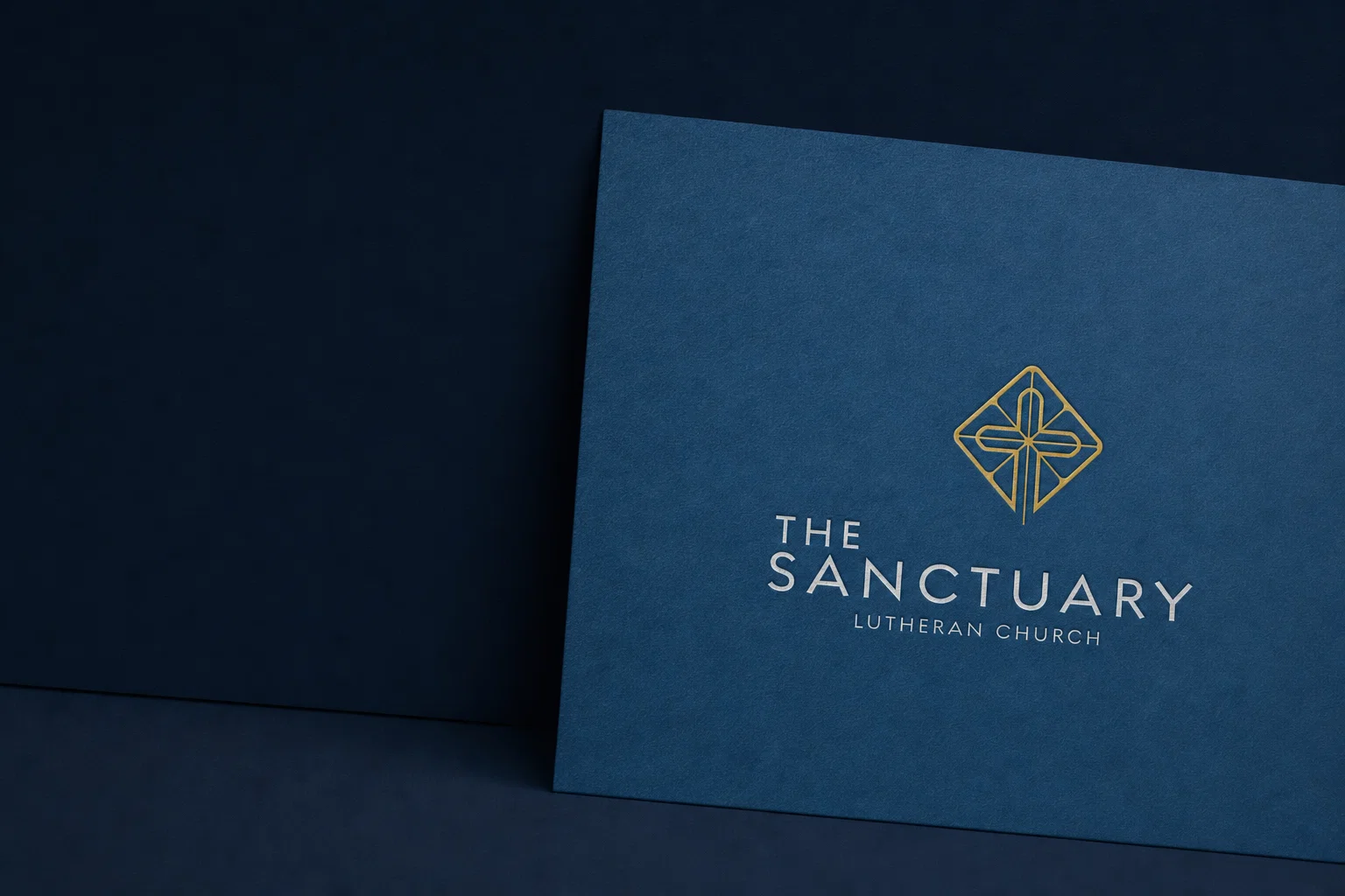
A new name, a new identity, and an unexpected marriage of the ancient and the modern.
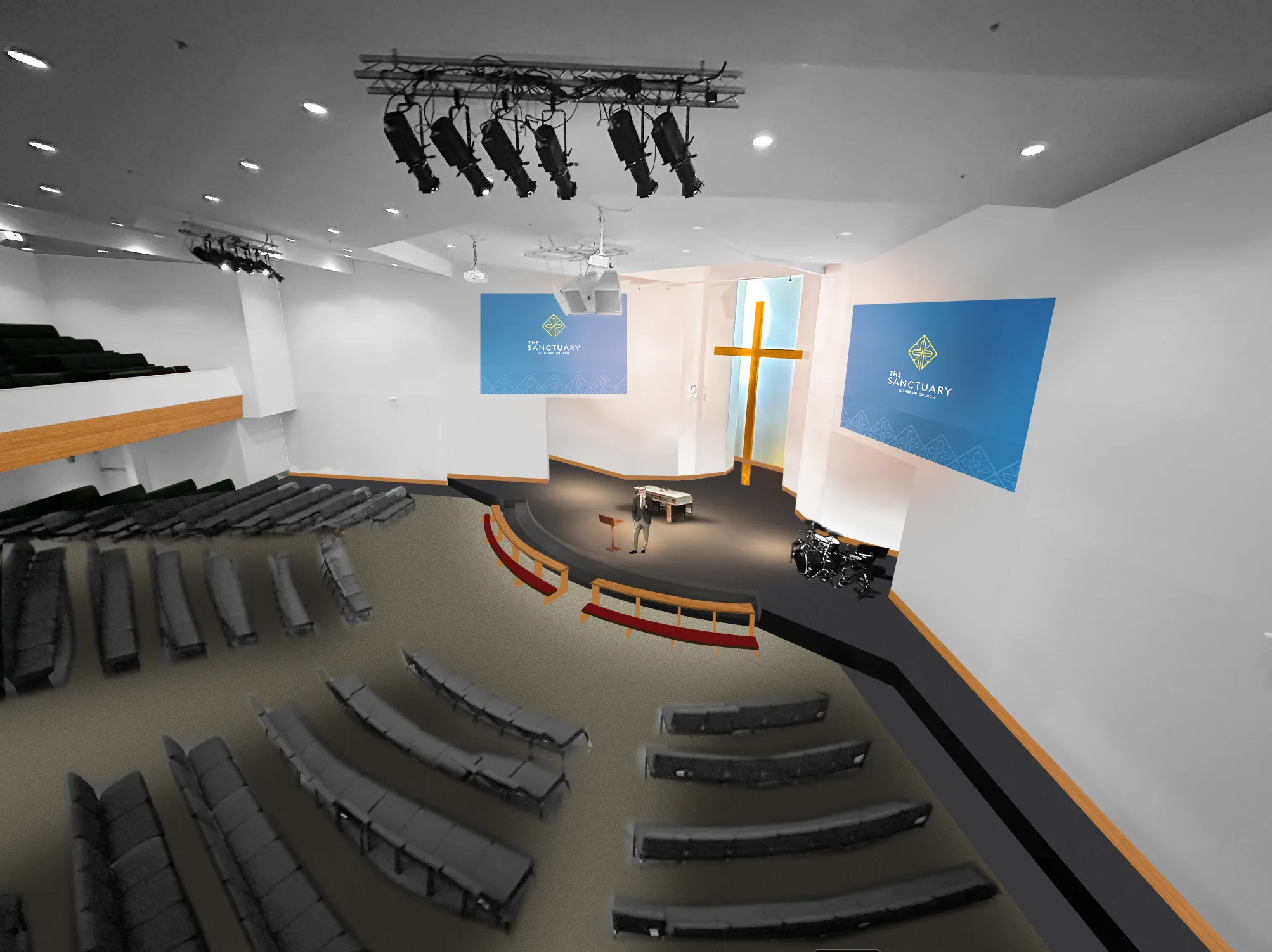
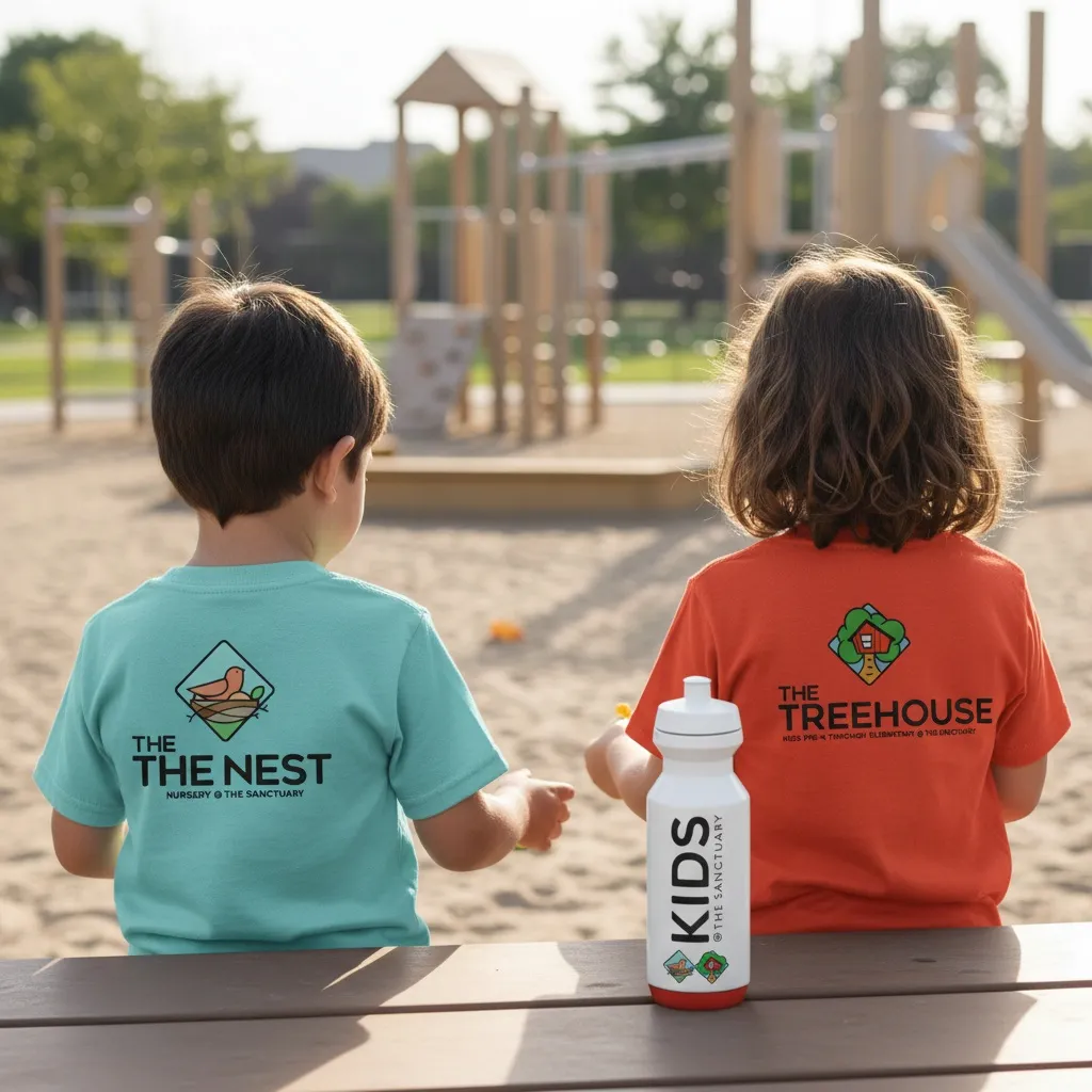
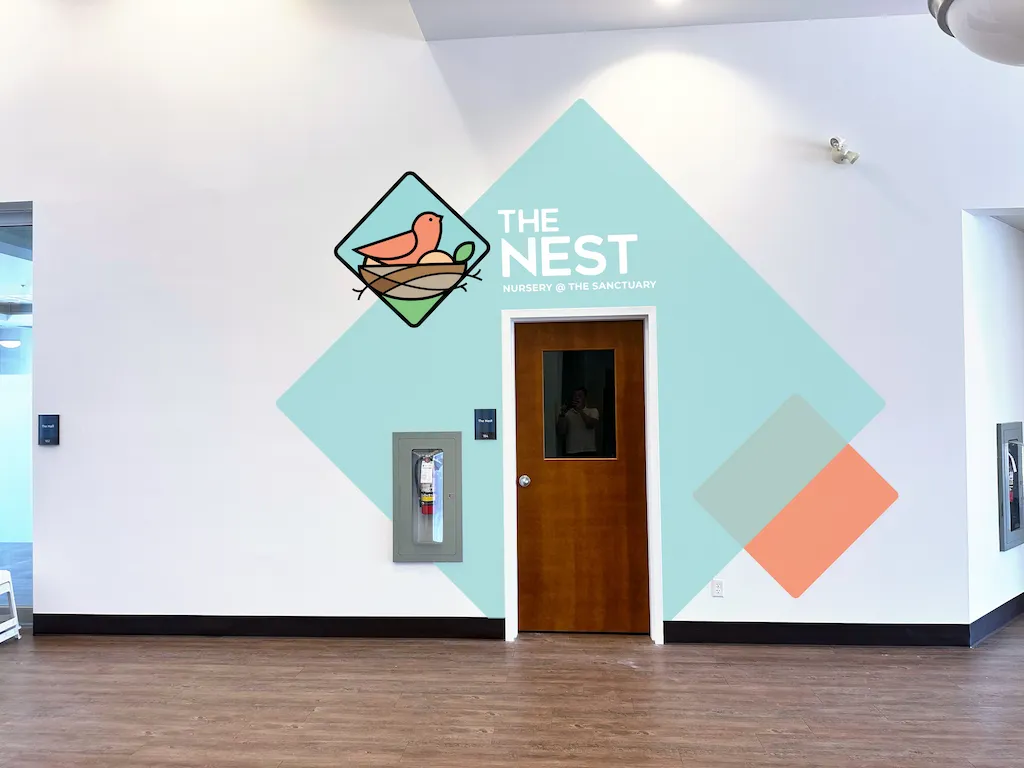
Engagement Group developed a complete brand strategy and visual identity for the church—including a new name: The Sanctuary Lutheran Church. The name is both inviting and honest—a place of refuge, depth, and genuine encounter with God, without abandoning the Lutheran heritage that gives it roots. The visual identity is one of the most distinctive in this portfolio: a geometric cross icon rendered in gold, set against a rich navy, with warm amber accents and the elegant pairing of Cera Pro and the Amalfi Coast script. It feels simultaneously like a heritage institution and something you'd encounter in a contemporary Kelowna coffee shop. Brand standards were developed across the main church identity and three fully realized sub-brands—The Nest (nursery), The Treehouse (kids), and The Living Room (students)—giving every ministry a distinct, cohesive identity under one roof.
Full Engagement

The Sanctuary Lutheran Church isn't just a branding project. It's a full-framework engagement—every service, every dimension, from the inside out. This included a complete church renaming, from First Lutheran Church of Kelowna to The Sanctuary Lutheran Church, as part of a broader effort to make a century of faithful ministry visible to the community it was always meant to reach.
Calling — Ethnography · Mission, Vision & Values · Team Dynamics
Connectivity — Guest Experience · Retention · Assimilation
Brand — Identity · Campus Experience · Digital Experience
Marketing — Communication · Social · Promotion

Concept
Timelessly relevant. Ancient faith. A thoroughly modern invitation.
The brand concept for The Sanctuary centers on a single, compelling tension: a church that honors the timeless without feeling stuck in time. The young Kelowna family this church is built to reach is design-aware, spiritually curious, and quietly skeptical of church that feels either too traditional or too produced. The Sanctuary brand speaks to both instincts at once. The gold geometric cross carries the weight of centuries of Christian symbolism while feeling unmistakably contemporary. The navy and amber palette is rich without being heavy. The script typeface adds warmth and humanity to layouts that might otherwise feel too polished. The result is a brand that quietly communicates: this church has done the hard work of being both true and relevant—so you don't have to choose.


Results
Client Quote Here


FAQ