A church that had quietly become something remarkable—finally wearing an identity that says so.
Problem
A church that had turned the corner internally—in a community that hadn't heard the news yet.
The young families driving past on their way into Franklin had no way of knowing what Grace Chapel had become. After a turbulent pastoral transition that played out against the backdrop of COVID and an increasingly politicized cultural moment, the church had taken on a reputation in the tight-knit Franklin community that no longer reflected reality. The campus still looked like the church it had been. The name still carried old associations. And the brand did nothing to signal the remarkable transformation quietly taking root inside. Meanwhile, Pastor Rob had assembled a staff, built a culture, and cultivated a congregation rooted in spiritual formation, authentic community, and a genuine love for the next generation. The church that had become something worth attending had no way of saying so.


Solution
A new name, a modern rustic identity, and a complete campus transformation—inside and out.
Full Engagement

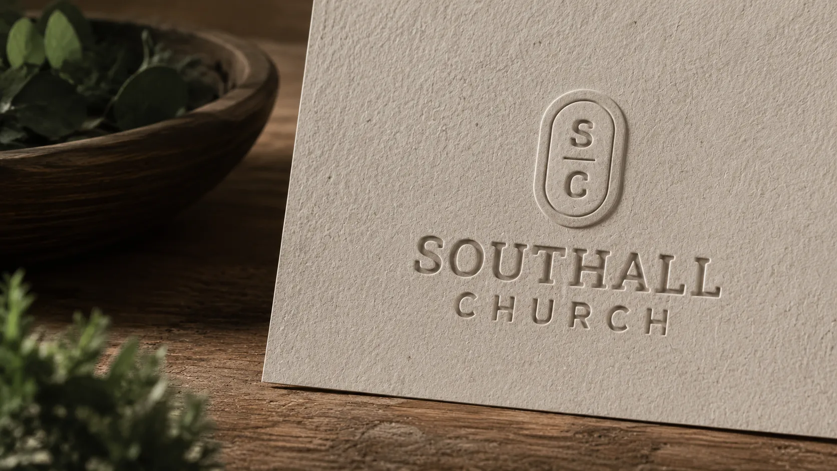
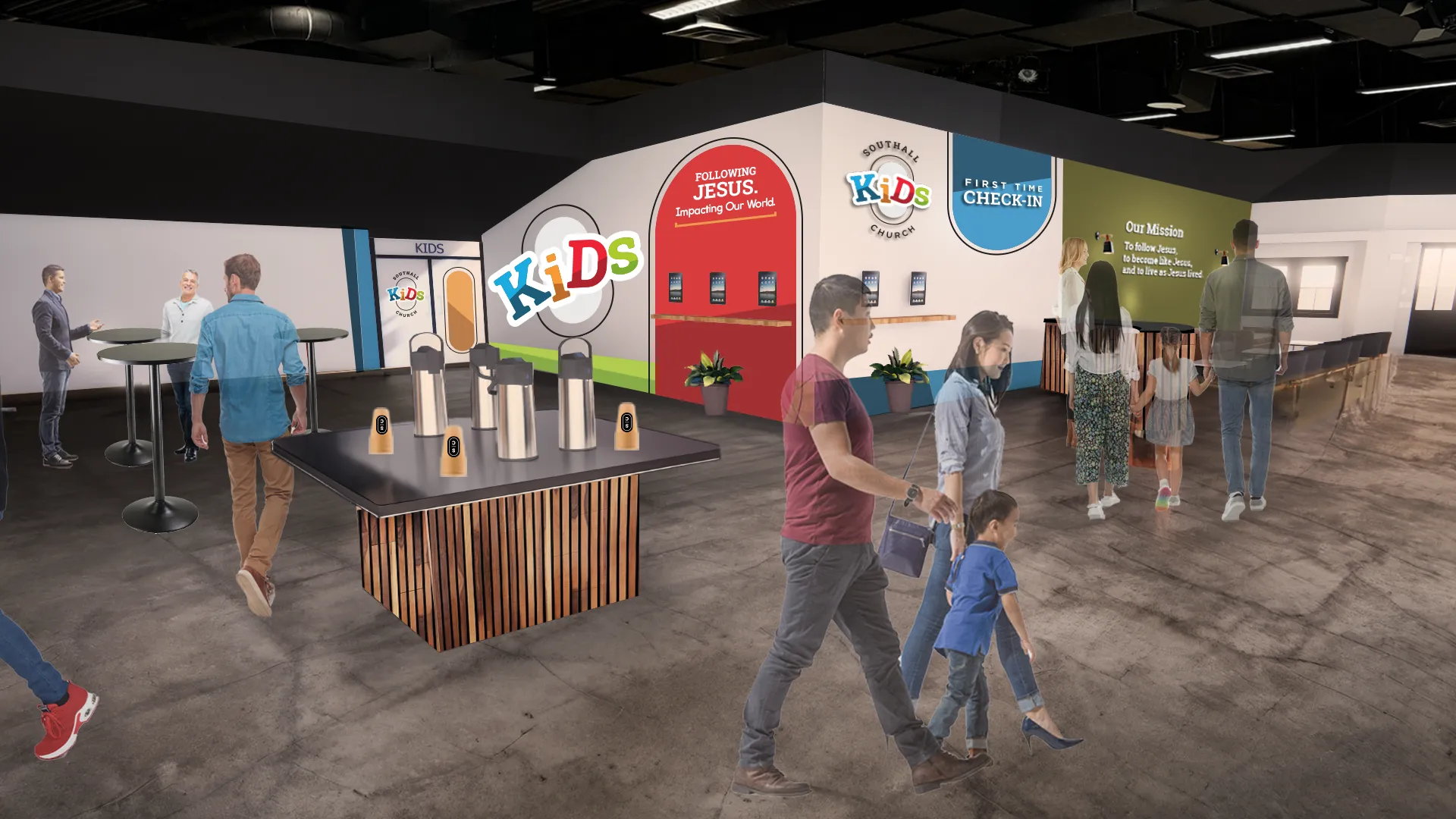
Southall Church isn't just a branding project. It's a full-framework engagement—every service, every dimension, from the inside out. This included a complete church renaming, from Grace Chapel to Southall Church, as part of a broader effort to step fully into the new season God had prepared—and to tell a community that didn't yet know it, that something worth discovering had arrived.
Calling — Ethnography · Mission, Vision & Values · Team Dynamics
Connectivity — Guest Experience · Retention · Assimilation
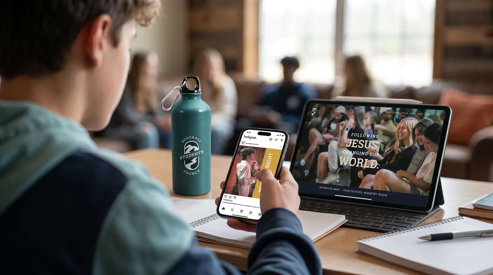
Brand — Identity · Campus Experience · Digital Experience
Marketing — Communication · Social · Promotion

Concept
Modern rustic, family-rooted, and unapologetically Franklin. Built so the 35-year-old is drawn to it and the 60-year-old sees a future in it.
The brand concept for Southall Church centers on a single, precise tension: the Franklin tension of rural upscale. This community lives at the intersection of rolling hills and designed experiences, farm fences and brand-savvy sensibilities, southern roots and contemporary expectations. Every element of the Southall brand is calibrated to that intersection. Olive green and rust speak the language of the land without looking rustic. The geometric SC badge is modern without being sterile. Warm, candid photography tells the story of a multigenerational community growing together with genuine depth of meaning. Generous negative space and clean, confident typography keep the identity feeling fresh and unhurried. The result is a brand that says, without a word: this is the church Franklin has been looking for.

Results
"Southall Quote Goes Here"
Rob Rogers | Senior Pastor


FAQ